25 January 2014

Red Barn Fix


At long last I was able to fix the roof on this Red Barn painting that I started oh-so-long-ago.  I'm much happier with it now!  It's funny how at the time I paint something, I can't see the problem, though I know something is wrong.  Yet coming back to it much later, it just jumps out.  I also added some shadowing around the roof to give it more dimension.  Looking at it now that I've posted it here, I need to add some shadow to the roof under the greenery as well.  Then it will be ready to frame!  

Red Barns ~ Summer
Here is the way it used to look.  You can see why the lower edge of the roof was bothering me!

FYI, this is the second in a series of four seasonal barns that I've been working on.  Next up is the Winter scene, which I hope to start once I finish Jacque Peak.  

22 January 2014

Jacque Peak WIP


I should have been sleeping yesterday afternoon since I worked last night, but instead I worked more on the Jacque Peak painting.  A painting knife has been my tool of choice for the snow fields.  The brush was leaving "fussy" marks when I wanted large smooth expanses.   

I'm happy with the way that this is coming to life.  Still a long way to go!  

21 January 2014

Birthday Roses

Birthday Roses with Model
My daughter got me some lovely pink and white roses for my birthday this past weekend.  I wanted to try and capture an impression of them in my favorite green vase.  I love painters like Christine Lafuente (see link in the sidebar) who can capture flowers and color and bring them to life with a minimum of brushstrokes.  I thought I'd have a go at it.  I ended up focusing on the light in the green glass vase.  Somehow the roses end up almost an afterthought.  I'm not sure why, but I have a really hard time painting roses that actually look like roses.   

Birthday Roses
They came out ok this time though ~ definitely more impressionistic than the vase though.  I may add just a couple of small tweaks to this where the shadows are concerned.  Otherwise, I think it's done.  

20 January 2014

Tweaking a Painting


This is a painting I did back in 2006.  While I liked the composition and the majority of the brushwork on it, something was "off" and I was never happy with it.  I got it out recently, hoping to frame it and immediately saw what was wrong with it.  The biggest problem was that the ellipse shape of the bottoms of both blue pieces was too flat and off.  They didn't sit on the same plane as the rest of the painting.  And the highlights were off slightly on the left most piece.  

 
This afternoon, I decided it was time to fix things, so after scrubbing it down with mineral spirits, I adjusted the bottom of both blue pieces and fixed the highlights and shadows on the left blue piece.  Posting it now, I see it needs one more small tweak on the rim.  I'm so much happier with this painting now!  Then it's time to get it in the frame! 

11 January 2014

Painting in Progress...

View from Vail Pass 2
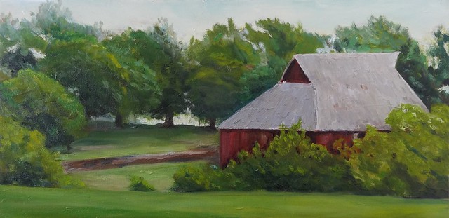
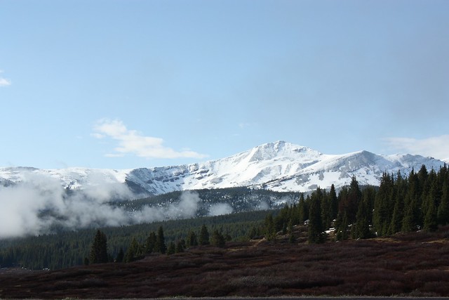
Though I love to paint Plein Air, I'm not a die-hard-must-get-out-there-no-matter-what painter.  When it's cold out, I much prefer to be in the warmth of my studio.  For this painting, I'm using a photo I took in 2009 of Jacque Peak, south/southeast of Vail Pass as my inspiration.  

When I took Marc Hanson's workshop last summer, he taught us that it helps to know "what" or "why" we are painting a particular scene.  He encouraged us to think about what it is about it that speaks to us and to remember that when painting.  I must admit that this is something that I don't find easy to do.  To come up with just ONE idea and focus on that is hard.  But I also found that it did help the focus of my painting.  

So why AM I painting this particular scene?  First, my middle son and his wife recently moved into a new place and have very bare walls.  They requested a mountain scene painting to go in a particular spot.  Second, as I went through years of photos looking for a nice mountain scene, this one lept to the forefront as a favorite.  To me it gives a glimpse of the scale and grandeur of the high Colorado mountain peaks.  I love the colorful expanse of marshy scrub in the foreground, the stately pines/firs/spruce of the middle ground and that soaring peak covered in snow in addition to Colorado's beautiful blue sky.  How does one choose just ONE idea out of that?   

Painting rough in
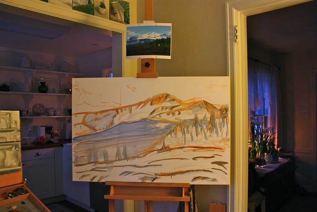
If I spend too much time thinking about what my one idea or thought is, sometimes it keeps me from painting... so I went to the canvas and sketched in a rough guideline of shape and value.  Then it was time to let it sit overnight. 

sky in, color blocking begun
This morning I started in earnest on the sky.  Which was quickly followed by putting in some snow shadows.  More blocking in of color to give the mountain shape.  

color blocked in
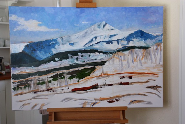
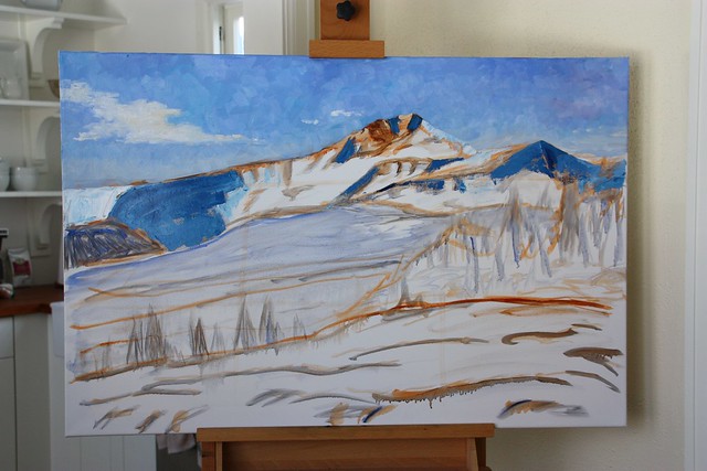
This is where I've gotten to.  More blocking, snow laid in on the mountain ~ with much more work to be done.  
I both love and dread this stage of painting.  What I love is that it begins to come to life if I've gotten the values right.  I can begin to see the painting that it can be.   What I dread, is that sometimes I get to this point and have no idea where to go next with it to complete it.  When working from a photo, it is sometimes too easy to fall into the trap of painting an exact copy of the photo.  Because photos tend to be on the flat side, the painting then looks flat too.  It is something I strive against, all that flatness.  Instead, I want it to have dimension.  I want desperately to give the painting life, to make it sing.

It's times like this that I wish I had the benefit of more formal training as a painter rather than being primarily self taught.  I know I have a good eye, but sometimes I don't quite understand the technique that would help get a painting where I want it to go.   

After working on this all morning, I'm going to let it rest for a bit.  Returning to it with fresh eyes often makes a positive difference and helps me see where things were going awry and where things are going well with a better perspective.  


06 January 2014

Value Studies

Still Life Value Studies 05Jan2014
I haven't painted much for the past couple of months, so to get back into it, I played around with some value studies.  These are done on a 12"x16" canvas board that as been marked off with photo/art tape into (4) 6"x 8"panels.  I learned this technique from Marc Hansen, when I took his plein air workshop last August.

Ultramarine Yellow white
This one, though it looks to be black and white, is actually painted with Ultramarine, yellow ochre, white and a touch of burnt sienna.

With that warm up, I'm ready to tackle a couple of larger projects!